When it comes to access control, do looks matter? Or only how the system performs? While functionality and security will always be paramount, understanding when and why aesthetics factor in can help integrators better serve their clients and create more successful deployments.
When aesthetics matter
Not every organization prioritizes the visual impact of their access control technology, but for some, it’s a critical consideration. Understanding which end companies fall into can help provide better guidance and avoid potential disappointment down the road.
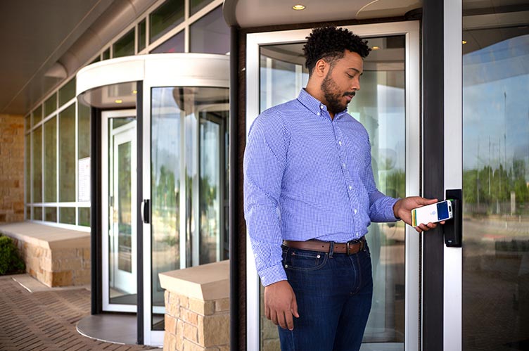
Client-facing environments are where aesthetics typically matter most. Law firms, corporate headquarters, high-end retail and hospitality venues view every touchpoint as a reflection of their brand. An outdated card reader in a pristine corporate lobby sends mixed messages about attention to detail and technological sophistication.
Employee experience-focused organizations are increasingly conscious of how workplace design affects recruitment and retention. In competitive talent markets, companies are investing heavily in creating environments that employees want to be in. Access control systems that look modern and feel intuitive contribute to that overall experience.
Property managers and developers understand that aesthetics can impact tenant attraction and retention. In competitive commercial real estate markets, the little details that signal modernity and quality can make the difference in lease negotiations.
Common design challenges
Even when organizations recognize the importance of aesthetics, they often face practical challenges in achieving their vision. Legacy system aesthetics create one of the most common problems. The challenge becomes modernizing the visual appeal without requiring an overhaul that might complicate connections with existing credentials and infrastructure.
Limited color options have historically constrained design flexibility. For decades, access control readers have predominantly come in dark colors, which don’t always complement modern architectural trends toward lighter, more open environments.
Inconsistent installations often result from piecemeal upgrades over time. Organizations end up with a mix of old and new readers, different mounting styles and varying cable management approaches that create visual inconsistency even when individual components look acceptable.
Key design considerations
When aesthetics matter, several factors can make or break the visual integration of access control systems.Form factor is often the first consideration. The size and profile of readers can significantly impact how they integrate with wall space and architectural elements. Slimmer, more compact designs tend to be less visually intrusive and easier to incorporate into modern design schemes.
Color and finish options have evolved significantly in recent years. While black remains the most common choice, the introduction of white readers has opened up new possibilities for organizations with lighter design palettes.
Installation quality can make even the most attractive hardware look unprofessional. Clean cable management, consistent placement and alignment, and attention to detail in mounting all contribute to the overall aesthetic impact.
Iconic and unexpected options on the market
The access control industry has responded to higher aesthetic expectations with a wider variety of design choices.For organizations looking to enhance existing proximity card systems, HID®’s Prox Premier readers have a more contemporary design while maintaining compatibility with existing Prox credentials and infrastructure. This allows for a bit of a design dial-up without needing to move to a different type of reader altogether — one they may not be as familiar or comfortable with.
These readers maintain full compatibility with existing HID Prox, AWID and EM4102 credentials while delivering an iconic form that complements newer builds. Additionally, with intelligent power management and control via HID Reader Manager, Prox Premier simplifies access control management while solving the visual integration challenge.
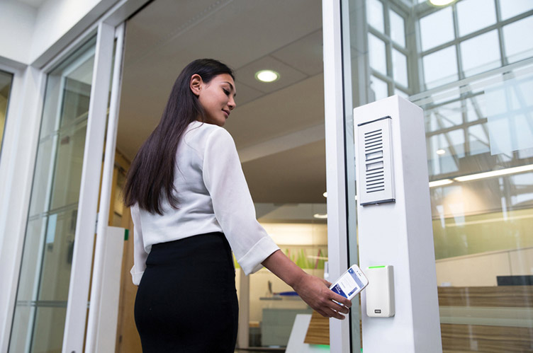 Color is another key factor. The introduction of white readers, like HID’s Signo White line, has given designers new flexibility to align access control with modern architectural trends. White readers can blend seamlessly into environments where traditional black hardware stands out awkwardly.
Understand what’s needed — and what’s coming
As access control technology continues to evolve, aesthetic integration is becoming easier and more sophisticated. Readers are getting smaller and more elegant, color options are expanding and design is increasingly top-of-mind with product teams. The key for integrators is understanding when aesthetics matter to their customers and having the knowledge and product options to address those needs effectively.
For some organizations, a basic black proximity reader perfectly serves their needs. For others, the visual impact of their access control system is a crucial component of their overall brand and user experience. By recognizing the difference and responding appropriately, system integrators can deliver solutions that satisfy both security requirements and aesthetic expectations, creating more successful projects and satisfied customers.